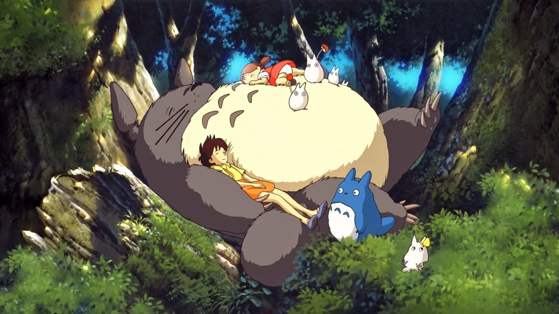
Explore the Enchanting World of Totoro!
Clicking this button will open up a world filled with the charming characters from My Neighbor Totoro.
My Neighbor Totoro and Friends

The charm of My Neighbor Totoro lies in its heartwarming story and the enchanting world created by its whimsical characters. The film paints a nostalgic picture of the Japanese countryside in the 1960s, evoking a sense of comfort in the hearts of the viewers. Totoro and his companions bring joy and wonder, delivering a touch of magic to the audience. The movie explores themes of family, friendship, and harmony with nature, delivering a warm message that transcends time and resonates with people of all ages.
#a. Research about dark mode
Dark mode, which has become a standard feature on various platforms such as Apple's iOS and MacOS, Windows, and Google, has prompted the exploration of diverse approaches to implement it on websites. These approaches include theme toggling, using separate stylesheets, leveraging CSS custom properties, and adopting server-side scripts.
One method to detect users' system color preferences involves using the prefers-color-scheme media query in CSS. Additionally, various approaches, such as utilizing CSS custom properties or implementing cookies through PHP, allow users to manually override and set dark mode preferences.
When designing a dark theme, considerations need to be made for images, shadows, typography, icons, color palettes, and more.
The debate on whether to implement dark mode continues, with arguments on both sides. However, the benefits, such as improved accessibility and maintaining battery life on devices with OLED screens, highlight the versatility and advantages of dark mode.
I found a particular interest in the color contrast aspect of dark design mode, and I relearned the importance of being mindful of the following points rather than simply inverting the colors:
- Use dark gray or light white instead of pure black or white.
- Opt for muted and light colors instead of vibrant ones in dark themes.
- In dark themes, it is recommended to use cooler colors (such as blue or purple) with moderate saturation.
- Adjust the intensity and transparency of colors based on text size and thickness. Font Size, Weight: Light, Contrast Ratio: 15 and above 12sp or less, Thin, 12 and above 18sp or less, Thin, 10 and above 18sp or less, Bold, 7 and above 18sp or more, Thin, 7 and above 18sp or more, Bold, 4.5 and above
- Utilize color contrast measurement tools to ensure compliance with accessibility standards.
When attempting to set colors while considering these points, I faced significant challenges. The colors I wanted to use were based on an image used in the header, but simply applying them resulted in poor color contrast, especially in dark mode. While it was fine in light mode, achieving a balanced color palette for both modes proved time-consuming, requiring multiple adjustments.
I believe that the stress caused by the imbalance of colors is universal. As someone inclined towards design aesthetics, I realized the constant need to be aware of using colors that are easily visible to everyone.
Reference:
- https://css-tricks.com/a-complete-guide-to-dark-mode-on-the-web/ (Indicated references)
- https://m2.material.io/design/color/dark-theme.html
- https://99designs.com/blog/web-digital/dark-mode/
- https://uxplanet.org/8-tips-for-dark-theme-design-8dfc2f8f7ab6
#b. Research about dark patterns
In User Experience Design, "dark patterns" involve designing the user interface of websites or apps in a malicious manner, intending to manipulate users into unintended actions or to prevent actions that may be disadvantageous to the company.
Examples of Dark Patterns:
- False Urgency: Creating a sense of urgency or scarcity to pressure consumers into making a purchase or taking an action.
- Hidden Costs: Concealing additional costs until users reach the final stages of a purchase, such as not displaying shipping fees or other charges upfront.